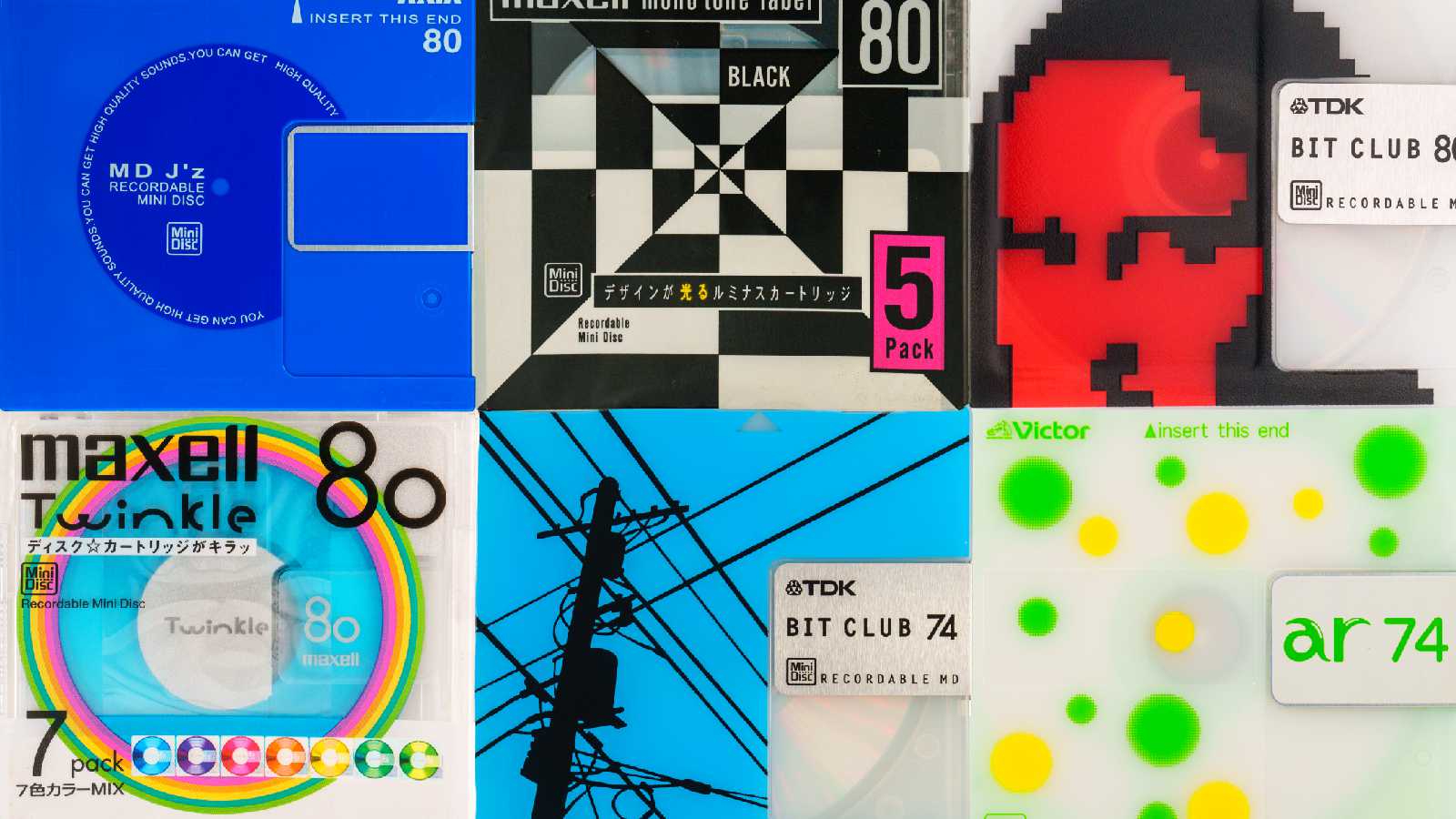
Matt Sephton shared something pretty cool: someone named asivery built a site devoted to the MiniDisc, showcasing all the different #MiniDisc packaging designs (and players) from the early ’90s through 2013 or so. Photos taken by Dan Marker-Moore.
When I think of ’90s–00s packaging and industrial design, the first thing that comes to mind is the bright, translucent colors that everyone started using after the #iMac came out in 1998. Reviewing the collection here, it’s interesting to note the presence of a lot of translucent Bondi blue several years before Apple made that color ubiquitous.
I rarely use physical media anymore (does anyone?) so it’s hard to compare, say, a CD case design from 2002 with a contemporary one. Nevertheless, I’ve had a sense that industrial #design has been getting more austere—i.e. less interesting—for a while now: curves, color, and translucency giving way to boxes, grayscale, and shiny surfaces.
minidisc.pics is a cool reminder that there was a time when tech products didn’t just look sleek and powerful, they looked fun.
