Uncategorized

VocabularAI

GPTZero lists words and phrases that are common indicators of #AI. The problem is that the words and phrases themselves are very common: “consequences”, “such as”, “primarily”.

These supposed AI-detection tools always make me uneasy. It’s hardly surprising that AI has a strong predilection for cliches of formal #writing; that’s what it’s trained on. It wouldn’t surprise me if #Wikipedia content alone has a noticeable impact on how these models write.

But the upshot is that it’s getting harder and harder to not sound like AI. I try to avoid cliches to begin with, but if I’m writing something boring and technical (like for work), that’s not always easy.

I understand the suspicion around AI. What’s worrying—and arguably as socially/culturally corrosive as the technology itself—is the superstition around it: seeing AI in every shadow, whether it’s there or not.

Equation

A colorful illustration of an equals sign, a "greater than" sign, and a division symbol.

Saw this sticker on the back of a car when I was out and about today. The design I saw was a little different; dark blue symbols instead of colored. I recreated it and made it more colorful, but it’s not my idea. I don’t know who came up with this design. I like it, though.

Cryptic brevity is the soul of wit.

Animal house

Random #Wikipedia browsing brought me to this: wild horses.

Wild horses live in herds with a social hierarchy, formed by a dominant adult male or sometimes multiple males (harem stallions), as well as several mares and their offspring. The harem stallion aggressively defends his herd/harem against rival males.

Sure, that’s about what you’d expect.

Upon reaching adulthood, both male and female horses disperse to other herds to avoid inbreeding, with young adult males also forming bachelor groups when they are around 3 years of age. In bachelor groups male horses engage in play and ritual behavior, with the group forming a hierarchy.

…apparently wild horses have frats.

(To be fair, the frat bros I knew in college behaved pretty much like wild horses, so this may not be the revelation I think it is.)

Nice symbols

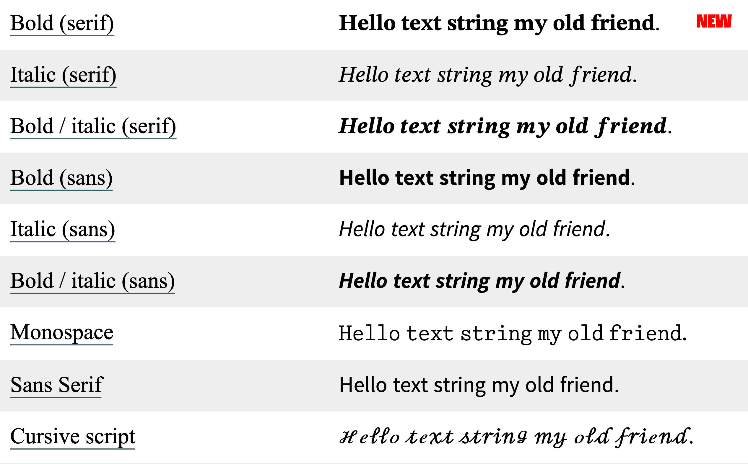
Just noticed that #Apple refreshed the alphanumeric symbols in its Unicode character set. I’m seeing the new characters on iOS 17 and macOS 13 (Sonoma). The following examples are from yaytext.com (colored backgrounds removed for legibility):

  • Serif, bold:
    • formerly: Times New Roman
    • now: something new (it’s not New York or Source Serif)
  • Serif, italic: still Times New Roman
  • Serif, bold-italic:
    • formerly: Times New Roman
    • now: something new
  • Sans, all styles:
    • formerly: something I can’t identify
    • now: pretty sure that’s Source Sans
  • Monospace:
    • formerly: CMU Typewriter Text Light
    • now: something new

Looks like they also updated the cursive and blackletter characters as well.

That’s a pretty subtle change. I haven’t seen it discussed anywhere. Apple has a history of paying attention to small refinements, so it wouldn’t be out of character for them to just do this because the new letters look better.

I wonder, though, if Apple was also considering how people commonly use these characters for bold and italic text in situations where text formatting isn’t supported, like social media posts. The earlier alphanumeric symbols often don’t look great when used in sentences—they’re choppy and irregular. Apple’s new symbols look a lot smoother.

That’s not necessarily a good thing. If the earlier Unicode characters looked rough, it’s because they were never meant to be applied to language at all; they’re intended to be mathematical symbols, used mainly in equations. Note in the images, for example, how the kerning is off on the lowercase italic serif f. That’s not really an f—it’s U+1D453: Mathematical Italic Small F, used for functions. (Ab)using these characters to apply styles to regular text is bad for accessibility and you should not do that.

Still, I’m impressed. I particularly love the redesigned #monospace. I wish that was its own typeface. Good classic typewriter faces are hard to find; I’ve tried. Most of the ones I’ve found are either (1) based on grungy scans of actual typewriter lettering—fine for novelty designs and attempts at period-specific documents, not good for longform content—or (2) variations of Courier. Classic #typewriter faces—the ones that use ball terminals and look like they came from an Underwood Number 5, not a Selectric—are pretty rare.

The nice ones I’m aware of:

  • Pitch, by Klim – commercial
  • DSE Typewriter – free
  • TT2020 – free (not to be confused with VT220, another ancient word-processing contraption whose native typeface is close to my heart, albeit for entirely different reasons)

It’s true that the Selectric did offer some classic faces, like Pica and Elite. Most of the Selectric’s typefaces look pretty modern though.

A Grand Day In

Apple Music has a surprisingly wide selection of Wallace and Gromit theme song covers, and today I’m listening to all of them:

And of course there’s this one-hour version of the original main theme. (Not sure if this is consistent enough to be a rule, but it does appear to be the case that for a lot of popular songs/themes, someone has done a one-hour version of them: see X-Files, Star Trek, etc.)

Wide blue yonder

This is neat. Someone’s building a image-focused app for Bluesky. It’s not intended to be an #Instagram clone, but you can see some resemblances.

Folks on #Mastodon and #Pixelfed might have noticed that Pixelfed has been getting some attention recently. I’ve been on Pixelfed for a little while, but for most of the time I was on there, I didn’t see a lot of adoption. That’s changing, especially as Pixelfed finally released an iOS app. Pixelfed is ActivityPub-based, so it was already possible to use Pixelfed via fediverse apps like Tusker, but a native app is the first thing potential users will look for. I’d been using the beta version on Test Flight; it’s not bad.

I would love to see more diversity in photo-sharing services. I always thought it was a shame that Flickr’s fortunes sunk the way they did.

(Glass is worth considering also.)

The Dock

25 years ago today, Steve Jobs revealed the new face of macOS: Aqua.

I didn’t see that demo, but I remember the moment I first saw Aqua. My dad showed me some screenshots in the New York Times one evening. I couldn’t stop looking at it—I’d never seen anything like it. I’d been fascinated with user interface #design for years at that point, and it hadn’t occurred to me that a computer could look like that. (I was still in high school.)

Former #Apple engineer James Thomson remembers that moment for a different reason: he was responsible for a pretty visible piece of Mac OS X. The Dock was one of the most notable new pieces of UI furniture in Mac OS X, replacing the top-right Finder menu that let you switch between active programs and making it a lot easier to get to your most frequently used apps. If anything melted down when Steve was showing off the Dock, Thomson’s name was on it.

The Aqua screenshots I saw were not from that demo, since I remember the Dock looking like the Dock we know: icons sitting on top of the white pinstriped background, rather than each icon having its own background. (I distinctly remember the magnification effect.) Nevertheless, the pre-Public Beta dock was interesting in its own right. Anyone who’s familiar with NeXTSTEP will recognize the influence.

I always enjoy these little flickers of how things happened behind the curtain, but I’m especially fascinated by the stories behind mundane things—the unglamorous Apple designs you barely think about, the so-fundamental-as-to-be-nearly-invisible elements like the Dock. I hadn’t known who designed the Dock (Bas Ording, who’s made a few other significant contributions to Apple UI design, such as text selection and the now-ubiquitous rubber-band effect), or that the Dock was codenamed Überbar, or that it was prototyped in Macromedia Director. I wish there was something like folklore.org for contemporary Apple products.

Collective Action

Andy Baio:

Nilay Patel frames The Verge’s endorsement of Kamala Harris around collective action problems: issues that require curbing the selfish behavior of individuals/companies for a greater good. Climate change, vaccines, school shootings, income inequality, tech/AI harms.

Curbing the selfish behavior of individuals/groups for a greater good is the underpinning of every human civilization there ever has been or will be. If you aren’t doing that, you don’t have a civilization.

Conservatives have always grappled with the relationship between regulation and civilization, to an extent that I’ve often wondered how different the Never Trump and Only Trump factions really were. The jaw-dropping number of high-level GOP folks endorsing Harris suggest that to some, at least, that connection is starting to become clear.

Ghost Town

The term “pumpkin carver” definitely doesn’t do the Ghost Town Pumpkin Festival justice. You have to experience this for yourself.

You’re a ghost. Not a particularly scary ghost, admittedly. You roam a world comprised of a small town with a Halloween carnival, along with other ghosts: other people across the internet, not Ghost Town NPCs.

The online community aspect (the other people you encounter when you’re exploring here) only works in October–November. I found this between Halloweens last year, so I first explored it during the game’s off-season when no one else was there. The servers that manage the online community were offline, but the environment itself is part of the download, so you can play Ghost Town locally any time. There’s just nobody else there playing it with you.

I think the off-season has to be the eeriest way to experience the game. The feeling you get wandering a small, deserted town at night—just you and you alone, when no one else is around and the only sign of life is the occasional light behind a window: that, I’d say, is when the game comes closest to conveying what it’s really like to be a ghost.