apple

The #Apple logo banner on apple.com has a distinctly Siri-esque shine to it today.

This being a Monday, I don’t have time to watch #WWDC, but I’ll be very curious to see if whatever Apple rolls out here fixes anything. #Siri is probably the most conspicuously underpowered product in Apple’s lineup right now, at a time when Apple is—supposedly—working on small wearable devices that do not have touchscreens and will, I assume, use Siri as their primary interface.

I have one such product already: a HomePod that I never use, mainly because I hate dealing with Siri. The fact that Apple is apparently upgrading Siri with a custom version of Gemini isn’t encouraging; we use #Gemini at work, and I haven’t found it to be nearly as capable as either #ChatGPT or #Claude. Still, Apple is not in a great place AI-wise right now, and the new #AI guy, Amar Subramanya, ran Gemini at Google, so I guess Gemini is the most obvious option.

Best case, Siri turns out to be like Apple Maps: a rough start, but improving year over year.

Worst case, Siri turns out to be like Apple Maps: even after 14 years of improvements, it still hasn’t fully caught up.

I’ll probably never completely leave #macOS, but given the degraded state of that platform, I’m looking at #Linux a lot more seriously than I used to.

It’s not even for all the Linuxy reasons that tech people prefer. It’s because I just want a user environment that isn’t overtly disrespectful: refusing to let me customize the UI, throwing ads and popups in my face every damned minute.

Switching from Mac to Linux because the user experience is better: think about that one for a sec.

Nice symbols

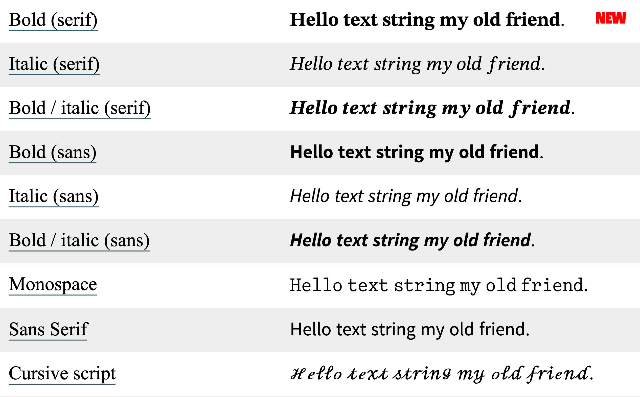
Just noticed that #Apple refreshed the alphanumeric symbols in its Unicode character set. I’m seeing the new characters on iOS 17 and macOS 13 (Sonoma). The following examples are from yaytext.com (colored backgrounds removed for legibility):

  • Serif, bold:
    • formerly: Times New Roman
    • now: something new (it’s not New York or Source Serif)
  • Serif, italic: still Times New Roman
  • Serif, bold-italic:
    • formerly: Times New Roman
    • now: something new
  • Sans, all styles:
    • formerly: something I can’t identify
    • now: pretty sure that’s Source Sans
  • Monospace:
    • formerly: CMU Typewriter Text Light
    • now: something new

Looks like they also updated the cursive and blackletter characters as well.

That’s a pretty subtle change. I haven’t seen it discussed anywhere. Apple has a history of paying attention to small refinements, so it wouldn’t be out of character for them to just do this because the new letters look better.

I wonder, though, if Apple was also considering how people commonly use these characters for bold and italic text in situations where text formatting isn’t supported, like social media posts. The earlier alphanumeric symbols often don’t look great when used in sentences—they’re choppy and irregular. Apple’s new symbols look a lot smoother.

That’s not necessarily a good thing. If the earlier Unicode characters looked rough, it’s because they were never meant to be applied to language at all; they’re intended to be mathematical symbols, used mainly in equations. Note in the images, for example, how the kerning is off on the lowercase italic serif f. That’s not really an f—it’s U+1D453: Mathematical Italic Small F, used for functions. (Ab)using these characters to apply styles to regular text is bad for accessibility and you should not do that.

Still, I’m impressed. I particularly love the redesigned #monospace. I wish that was its own typeface. Good classic typewriter faces are hard to find; I’ve tried. Most of the ones I’ve found are either (1) based on grungy scans of actual typewriter lettering—fine for novelty designs and attempts at period-specific documents, not good for longform content—or (2) variations of Courier. Classic #typewriter faces—the ones that use ball terminals and look like they came from an Underwood Number 5, not a Selectric—are pretty rare.

The nice ones I’m aware of:

  • Pitch, by Klim – commercial
  • DSE Typewriter – free
  • TT2020 – free (not to be confused with VT220, another ancient word-processing contraption whose native typeface is close to my heart, albeit for entirely different reasons)

It’s true that the Selectric did offer some classic faces, like Pica and Elite. Most of the Selectric’s typefaces look pretty modern though.

The Dock

25 years ago today, Steve Jobs revealed the new face of macOS: Aqua.

I didn’t see that demo, but I remember the moment I first saw Aqua. My dad showed me some screenshots in the New York Times one evening. I couldn’t stop looking at it—I’d never seen anything like it. I’d been fascinated with user interface #design for years at that point, and it hadn’t occurred to me that a computer could look like that. (I was still in high school.)

Former #Apple engineer James Thomson remembers that moment for a different reason: he was responsible for a pretty visible piece of Mac OS X. The Dock was one of the most notable new pieces of UI furniture in Mac OS X, replacing the top-right Finder menu that let you switch between active programs and making it a lot easier to get to your most frequently used apps. If anything melted down when Steve was showing off the Dock, Thomson’s name was on it.

The Aqua screenshots I saw were not from that demo, since I remember the Dock looking like the Dock we know: icons sitting on top of the white pinstriped background, rather than each icon having its own background. (I distinctly remember the magnification effect.) Nevertheless, the pre-Public Beta dock was interesting in its own right. Anyone who’s familiar with NeXTSTEP will recognize the influence.

I always enjoy these little flickers of how things happened behind the curtain, but I’m especially fascinated by the stories behind mundane things—the unglamorous Apple designs you barely think about, the so-fundamental-as-to-be-nearly-invisible elements like the Dock. I hadn’t known who designed the Dock (Bas Ording, who’s made a few other significant contributions to Apple UI design, such as text selection and the now-ubiquitous rubber-band effect), or that the Dock was codenamed Überbar, or that it was prototyped in Macromedia Director. I wish there was something like folklore.org for contemporary Apple products.