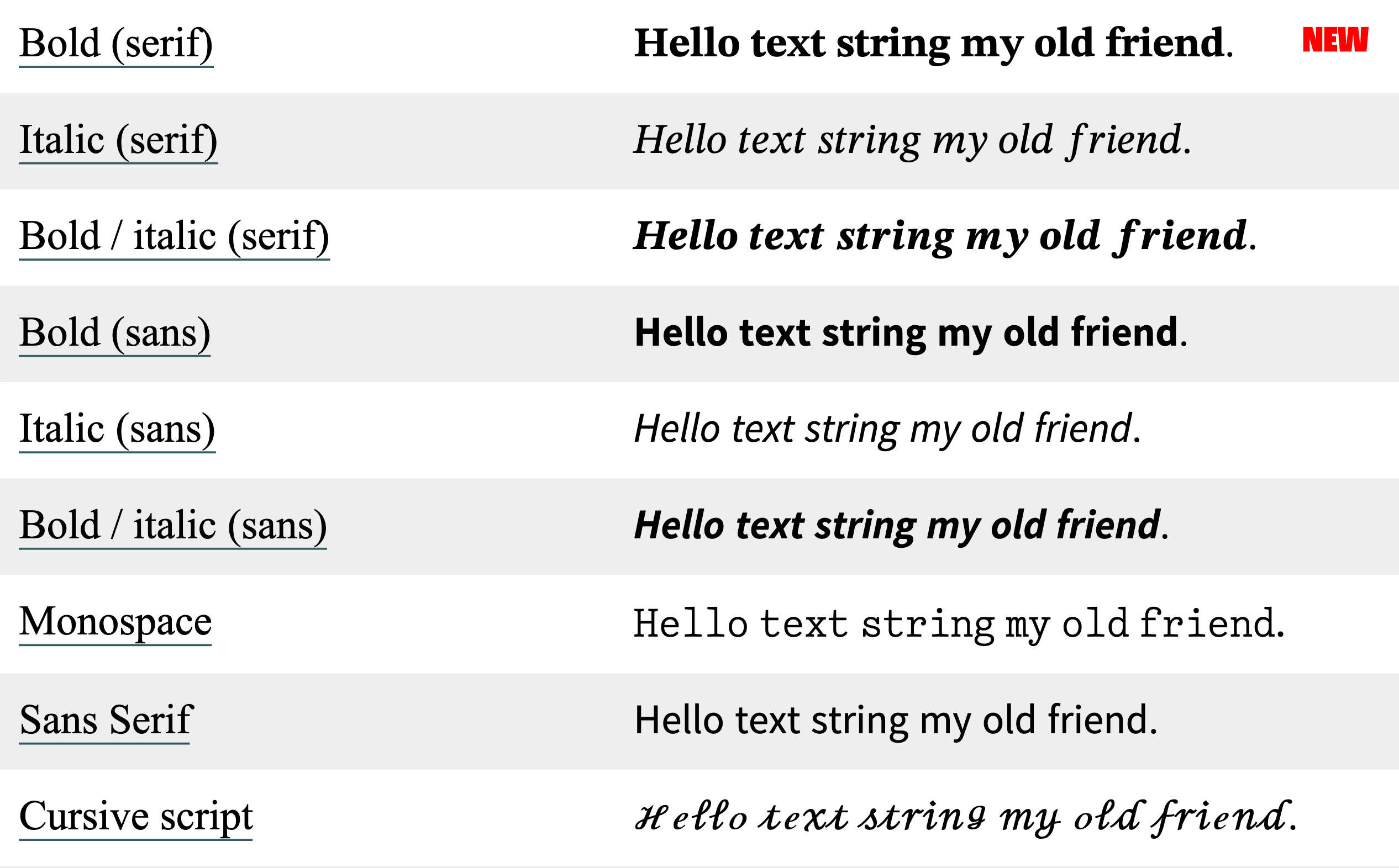
Just noticed that #Apple refreshed the alphanumeric symbols in its Unicode character set. I’m seeing the new characters on iOS 17 and macOS 13 (Sonoma). The following examples are from yaytext.com (colored backgrounds removed for legibility):
- Serif, bold:
- formerly: Times New Roman
- now: something new (it’s not New York or Source Serif)
- Serif, italic: still Times New Roman
- Serif, bold-italic:
- formerly: Times New Roman
- now: something new
- Sans, all styles:
- formerly: something I can’t identify
- now: pretty sure that’s Source Sans
- Monospace:
- formerly: CMU Typewriter Text Light
- now: something new
Looks like they also updated the cursive and blackletter characters as well.
That’s a pretty subtle change. I haven’t seen it discussed anywhere. Apple has a history of paying attention to small refinements, so it wouldn’t be out of character for them to just do this because the new letters look better.
I wonder, though, if Apple was also considering how people commonly use these characters for bold and italic text in situations where text formatting isn’t supported, like social media posts. The earlier alphanumeric symbols often don’t look great when used in sentences—they’re choppy and irregular. Apple’s new symbols look a lot smoother.
That’s not necessarily a good thing. If the earlier Unicode characters looked rough, it’s because they were never meant to be applied to language at all; they’re intended to be mathematical symbols, used mainly in equations. Note in the images, for example, how the kerning is off on the lowercase italic serif f. That’s not really an f—it’s U+1D453: Mathematical Italic Small F, used for functions. (Ab)using these characters to apply styles to regular text is bad for accessibility and you should not do that.
Still, I’m impressed. I particularly love the redesigned #monospace. I wish that was its own typeface. Good classic typewriter faces are hard to find; I’ve tried. Most of the ones I’ve found are either (1) based on grungy scans of actual typewriter lettering—fine for novelty designs and attempts at period-specific documents, not good for longform content—or (2) variations of Courier. Classic #typewriter faces—the ones that use ball terminals and look like they came from an Underwood Number 5, not a Selectric—are pretty rare.
The nice ones I’m aware of:
- Pitch, by Klim – commercial
- DSE Typewriter – free
- TT2020 – free (not to be confused with VT220, another ancient word-processing contraption whose native typeface is close to my heart, albeit for entirely different reasons)