page 4

Your favorite movie is vertical now

A friend recently shared this video from Kendra Gaylord, describing how your favorite movie is vertical now, courtesy of #AI —and what is lost in the process:

In movies, every time something is filmed, it’s memorializing a lot: the actors, the location, the way we talk and write and joke. Even though it’s fiction, it’s still a document, and if you mess with that document too much, it doesn’t represent all of those things anymore.

One of the most perverse revelations here is that the AI-generated version felt more realistic to people simply by virtue of being vertical; the same aspect ratio in which we experience social media videos. Our window to reality is portrait-shaped.
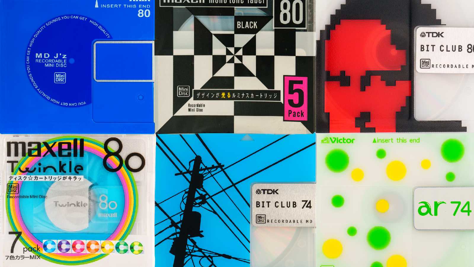
minidisc.pics

A grid of six minidisc cover designs. They are colorful, and have interesting graphics: a white and black geometric pattern, a red pixel-art version of the Mona Lisa, yellow and green polka dots, etc.

Matt Sephton shared something pretty cool: someone named asivery built a site devoted to the MiniDisc, showcasing all the different #MiniDisc packaging designs (and players) from the early ’90s through 2013 or so. Photos taken by Dan Marker-Moore.

When I think of ’90s–00s packaging and industrial design, the first thing that comes to mind is the bright, translucent colors that everyone started using after the #iMac came out in 1998. Reviewing the collection here, it’s interesting to note the presence of a lot of translucent Bondi blue several years before Apple made that color ubiquitous.

I rarely use physical media anymore (does anyone?) so it’s hard to compare, say, a CD case design from 2002 with a contemporary one. Nevertheless, I’ve had a sense that industrial #design has been getting more austere—i.e. less interesting—for a while now: curves, color, and translucency giving way to boxes, grayscale, and shiny surfaces.

minidisc.pics is a cool reminder that there was a time when tech products didn’t just look sleek and powerful, they looked fun.

Into Eternity

Michael Madsen’s #documentary Into Eternity takes a look at the Onkalo long-term nuclear waste facility, located on the west coast of Finland. Onkalo—“hiding place”—is designed to last for at least 100,000 years; an ambitious proposition, considering that the oldest man-made structures on Earth are less than 10,000 old.

Ensuring structural integrity for tens of thousands of years—or, as one official points out, just the next hundred—is no small requirement, but the designers also have to consider one of the most challenging #design problems in the world: how to communicate with unknown civilizations with whom we may have very little in common. What if, thousands of years from now, someone stumbles on Onkalo and doesn’t realize the danger? Imagine a 19th-century archaeological expedition encountering nuclear waste buried by ancient Egyptians.

A bit on the artsy side, but still, a fascinating—and often beautiful—look at where some of the worst stuff on earth is kept away.

Keep it personal

I think one of the most important features that #Mastodon has and #Bluesky doesn’t is the ability to follow someone and see their posts, but hide third-party content they’re reposting. It might seem small, but it’s the number one issue that discourages me from following people on Bluesky. I want to subscribe to someone’s work without signing up for a torrent of memes and political stuff.

You have this level of control on Mastodon. You don’t on Bluesky.

Collective Action

Andy Baio:

Nilay Patel frames The Verge’s endorsement of Kamala Harris around collective action problems: issues that require curbing the selfish behavior of individuals/companies for a greater good. Climate change, vaccines, school shootings, income inequality, tech/AI harms.

Curbing the selfish behavior of individuals/groups for a greater good is the underpinning of every human civilization there ever has been or will be. If you aren’t doing that, you don’t have a civilization.

Conservatives have always grappled with the relationship between regulation and civilization, to an extent that I’ve often wondered how different the Never Trump and Only Trump factions really were. The jaw-dropping number of high-level GOP folks endorsing Harris suggest that to some, at least, that connection is starting to become clear.

Ghost Town

The term “pumpkin carver” definitely doesn’t do the Ghost Town Pumpkin Festival justice. You have to experience this for yourself.

You’re a ghost. Not a particularly scary ghost, admittedly. You roam a world comprised of a small town with a Halloween carnival, along with other ghosts: other people across the internet, not Ghost Town NPCs.

The online community aspect (the other people you encounter when you’re exploring here) only works in October–November. I found this between Halloweens last year, so I first explored it during the game’s off-season when no one else was there. The servers that manage the online community were offline, but the environment itself is part of the download, so you can play Ghost Town locally any time. There’s just nobody else there playing it with you.

I think the off-season has to be the eeriest way to experience the game. The feeling you get wandering a small, deserted town at night—just you and you alone, when no one else is around and the only sign of life is the occasional light behind a window: that, I’d say, is when the game comes closest to conveying what it’s really like to be a ghost.

Ran across an unreleased redesign of the BeOS UI. I hadn’t seen this before. It would have been a pretty drastic change to the UI, and I wonder how it would have been received.

I’ve always loved the original #BeOS user interface. For something that was apparently designed by engineers, it was notably clean and elegant. More, it was iconic, in a way that few 90s GUIs are. The simple yellow tabs are immediately identifiable. Nothing else looked like BeOS—it had a quirky but well-crafted distinctiveness that felt very Apple-y. (Unsurprising, given how many Be folks had worked at Apple.)

The new design introduces complexity: more shapes, more borders, more dimensionality. Sanders, the designer, says that this was intended to modernize the experience. I don’t doubt they had justifications for this, but it does make me wonder what thinking was taking shape at Be, and where the company would have gone if they’d made it past 2001.

Eco-music

I wonder if Honda sells hour-long audio tracks of the ethereal drones their electric vehicles make. I could see that being very relaxing.